Trusting Home Trust
There is a huge financial life outside of the “Big Five“1. Sometimes word of mouth gets them to you, other times you just come across it. They are almost always more forgiving and understanding than bigger corporations, thus easier to work with in person.
However, they might lack the power to hire multiple-departments-worth of digital workers that enable automation-driven and marketing-focused assets that eminate aforementioned trust and warmth.
Home Trust’s website is—unfortunately—no exception.
Let’s deconstruct the page first.
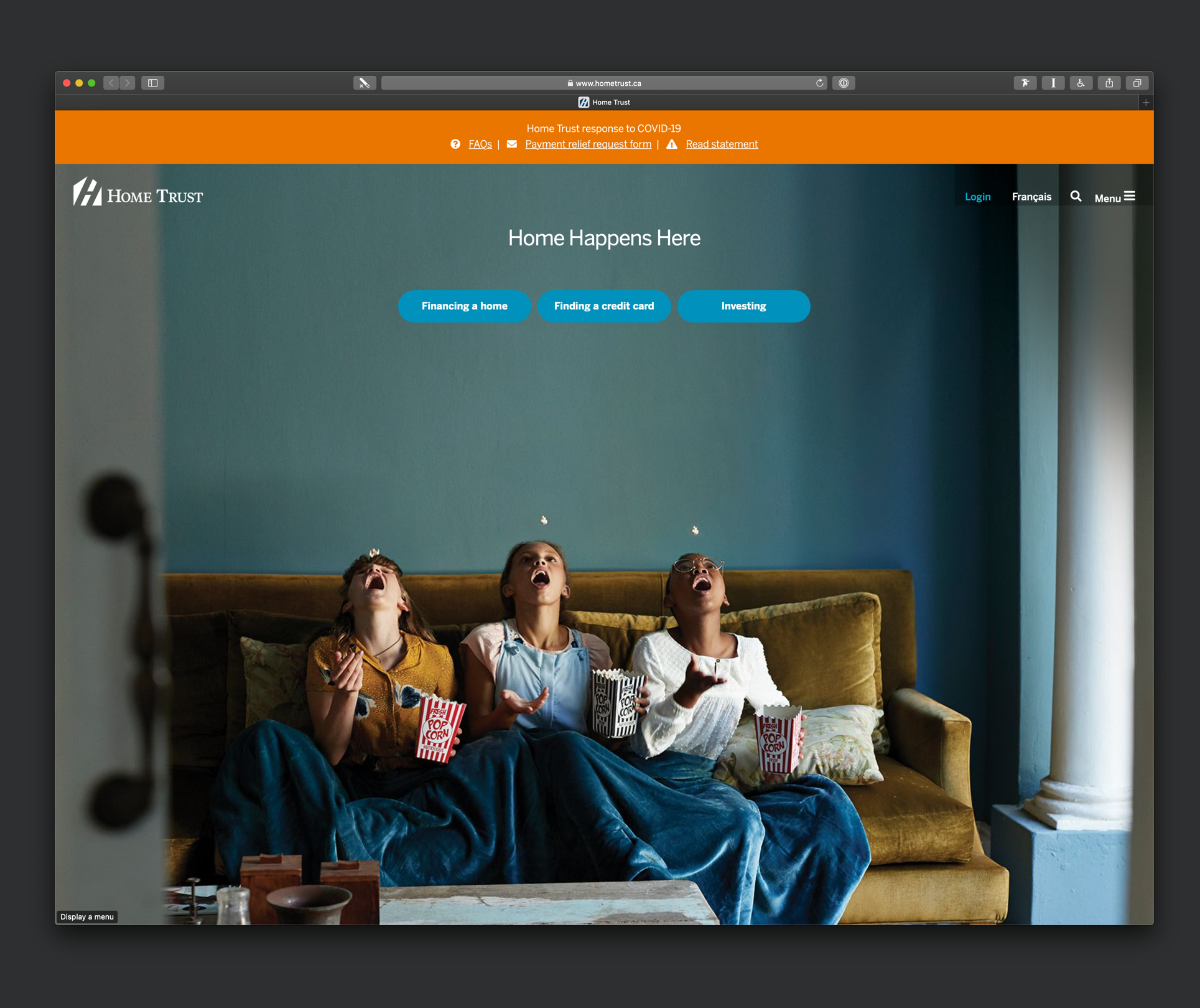
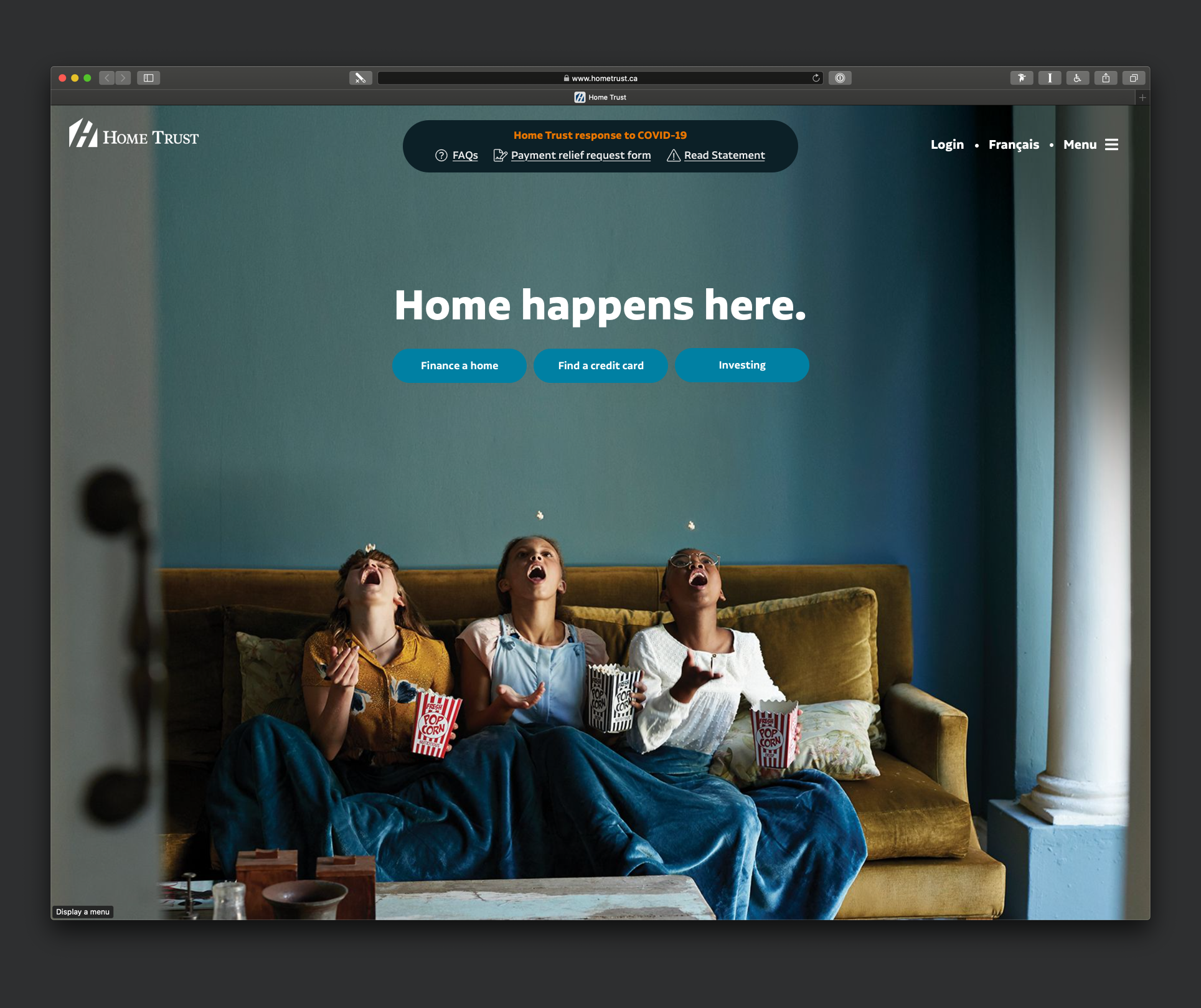
1. COVID-19 Banner
Edge to edge bright orange banner is worthy of a panic-inducing situation, but this pandemic actually requires a calm cautiousness.
The bright background colour also doesn’t help with the contrast of the white text, resulting in inaccessible messaging.
Finally, the placement above the logo and header of the website, while maybe technically easier to implement, makes it feel like it’s not a part of the site.
2. Tagline
“Home Happens Here” is a great tagline and with the full background image of 3 children eating popcorn on a sofa, with an out of focus door slightly covering left side of the photo… :chefs-kiss:2
However, the placement and typography of the tagline doesn’t really connect with the image. It’s far too small, way too up high, and punctuation is non-existent.
3. Menu
The menu in the top right corner has 4 items with bad spacing and inconsistent labeling. The use of semi-translucent black background makes the small, thin, white text easier to read, but the blue colour given to the “Login” item to differentiate it actually makes it blend in with the blue walls in the background image.
4. Action Buttons
Right below the tagline are 3 rounded buttons:
- Financing a home
- Finding a credit card
- Investing
The white text on blue background results in a slightly low contrast, but only requires a tiny adjustment to make it WCAG-compliant.
Now let’s improve it.
1. Making the COVID-banner part of the page.
Let’s tackle the largest part first.
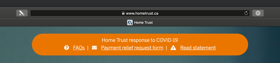
Centering the banner between the menu and the logo immediately brings the content within the context of the company.
Now lets make the text accessible.
Hmm… That didn’t quite really work—it’s definitely easier to read (the bolder text helps too), but it also pulled away from the “warning” sensation and just doesn’t look nice.
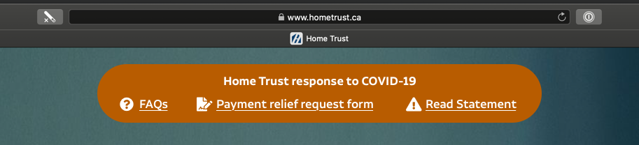
Let’s move in a different direction. See how we can pull it completely away from “warning” into “information” zone.
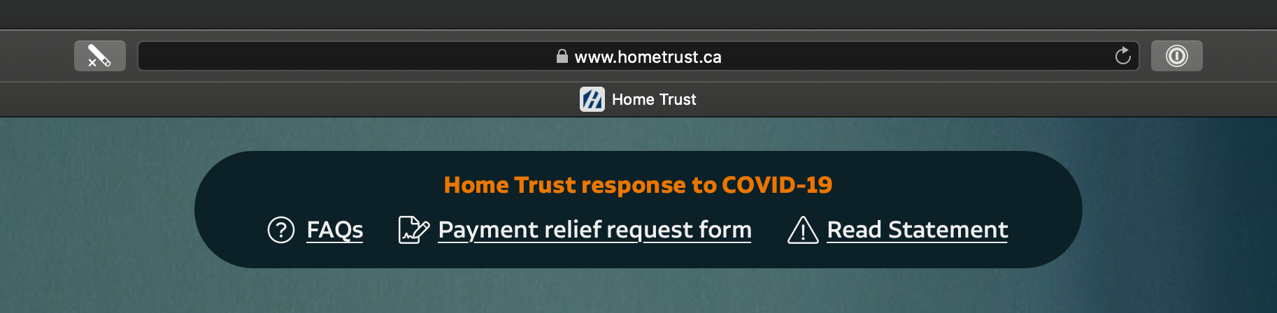
This seems to work! The dark blue background is really in-line with the blue tones of the overall website, and stands out as a messaging component. The orange title is easy to read, and conveys that there is an outstanding situation that needs attention without creating a panicky environment. And the white links are now easier to differentiate as individual items.
2. Taglines, Actions, and Wording
This was relatively easier to handle.
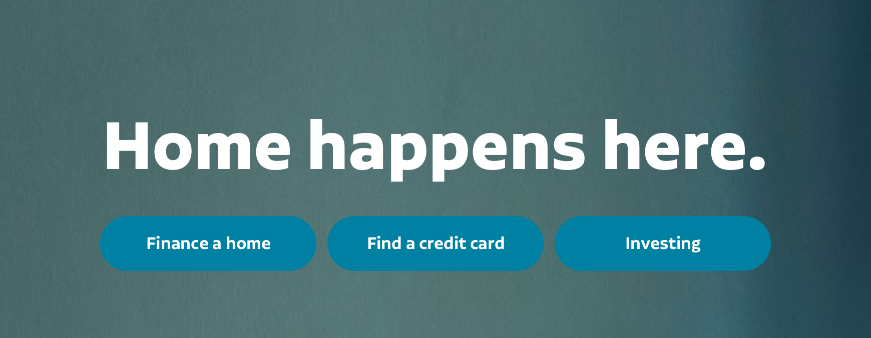
Increased font size, font weight, and top margin brings the tagline closer to the children sitting on the couch, creating a more immersive effect. Changing from title case to sentence case adds to the candidness of the tagline.
A slight darkening of button backgrounds may seem imperceptible, but increases contrast to WCAG-compliant levels. As for langage, removing -ing from first two actions3 make them seem more approachable and actionable.
3. Keeping the Menu
The way the menu works requires a deeper dive. The sliding sidebar menu and the affordance-free search feature require a functional refresh that’d require a blog post in and of itself. But we can improve the presentation on the page.
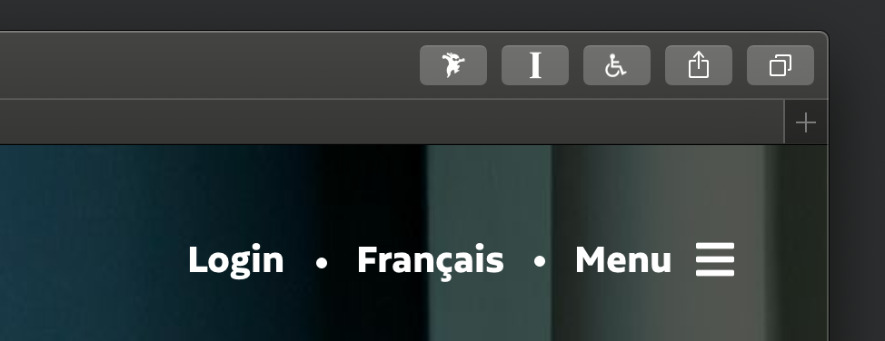
Removed the black translucent background, because the top right corner of the image is brilliantly dark enough that a white text laid on top of it has a contrast ratio ranging from 7.5:1 at worst and over 10:1 at best.
Increasing the font-weight and size, and adding dots between the items gave them a more distinct look. “Login” could be given a different colour or a background, but the layout and scarcity of items make it so that they don’t require a differentiation effort at this stage.
Bringing it all together.
Just 3 little changes came together to make a big impact. The result is an accessible, more approachable, and warmer page that adds to the institutions trustworthiness.
- I’m sure this applies to other countries as well, localize at your convenience. ↑
- As a former photographer, I could spend days talking about this photo. ↑
- Kept the -ing in “investing” because it’s more of a term and less of a verb here. A better option to keep the tone consistent might be “Start Investing”, perhaps… ↑