Playing (With) Numbers
It is usually okay to have numbers of different shapes and sizes next to each other. After all, you can’t expect a “1” and an “8” to be the same width, that’s just unreasonable.
Unless, you put them one below the other (like in a table), or animate them (like for a countdown). Then you want them all to be the same width, all the time. That’s when all reason goes out the window.
Kinda like this:
What happens here is, as numbers change, so do their widths. That’s why as numbers count down, the section constantly moves.
Not only that, but also because this counter is confined to certain boundaries, if the collective width of numbers exceed that, it pushes some of the content in a new line.
Good news is that the fonts themselves actually have built-in features to help us with this issue!
Most of the fonts available for us to use have fixed-width variants of their numerical glyphs. These are a part of secret-ish features that usually require a bit of tweaking to reach.
For The Web
To use them in web, one only has to define it within CSS.
.countdown {
font-variant-numeric: tabular-nums;
}
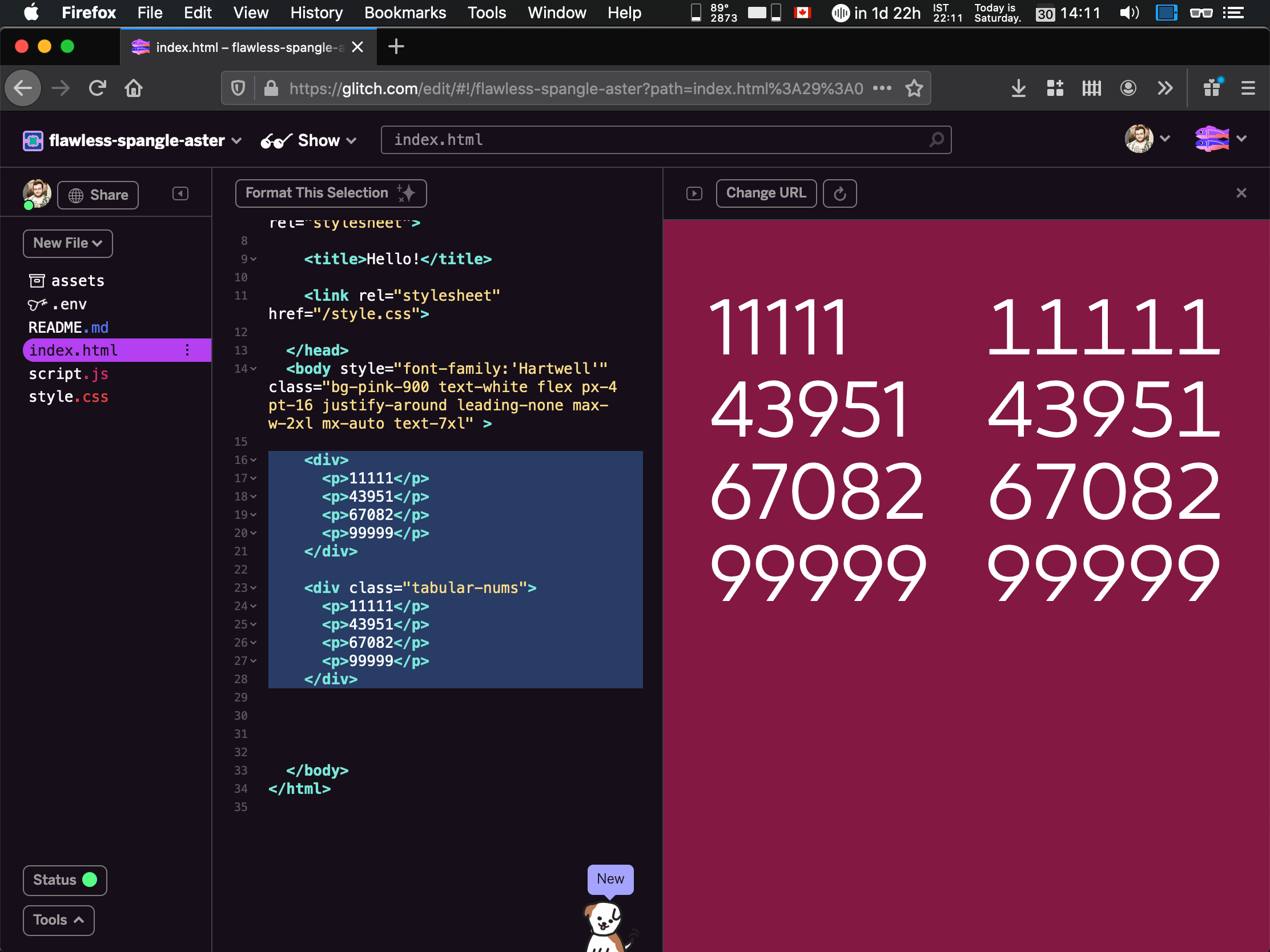
Or, y’know, if you don’t hate Tailwind, just add tabular-nums to your class.
In practice, the difference is night and day:
Here’s another demo I made:
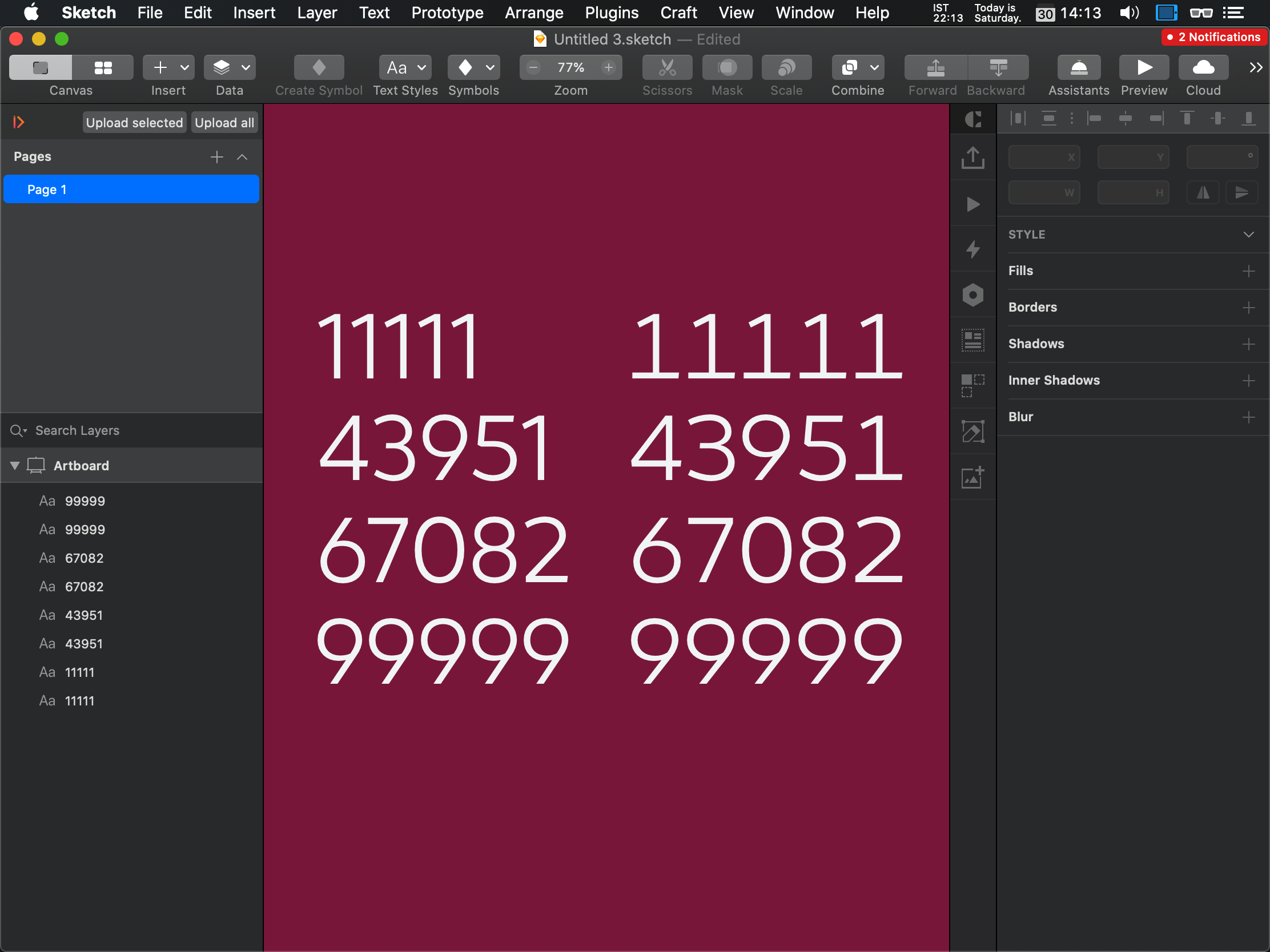
Same font, same values, one with tabular-nums and one without:
What about designers?
The implementation details of trivial features keep the eternal flame of the feud between designers and developers ever-so-brightly burning.
I’m not feeding the fire though.
(Not today, anyway.)
Sketch
My design tool of choice uses macOS’s built-in typography features, but also has a nifty set of shortcuts built right into the menubar.
If you go to Text > OpenType Features > Number Spacing, and select Monospaced Numbers, you’ll get the same effect as the CSS snippet above.
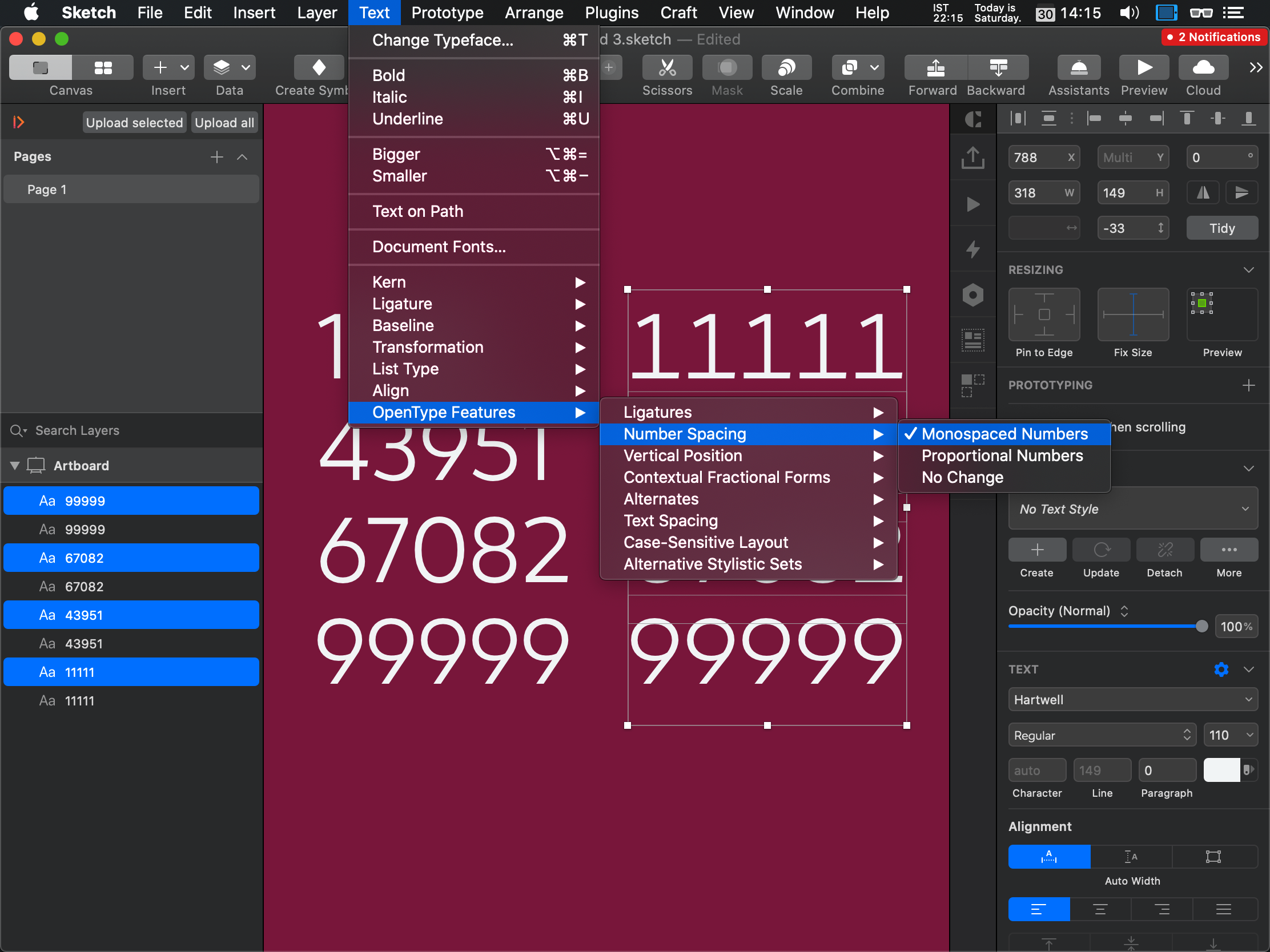
As a result, you get what you want: Numbers properly aligned, no matter what their value is.
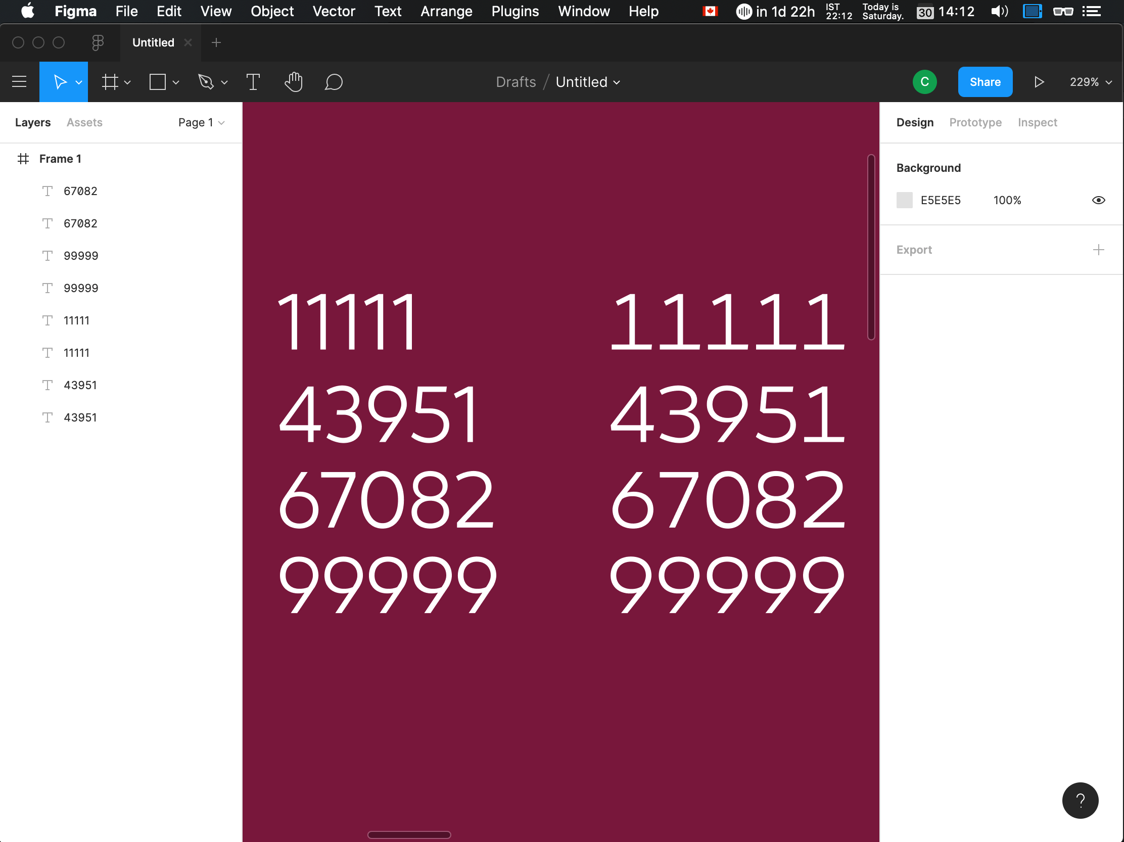
Figma
As with many design basics, Figma makes it a bit harder to both discover and recall1 this feature. Points for them for including it though—it could’ve just as easily been lost to the wind, not unlike many other basic features it should have.
- Find the “Text” section from the right sidebar.
- Just before the end of that section, find the button with the three dots in it. It says “Type Details” when hovered.
- Find the “Numbers” section in the popup, and find the “Style” line within it.
- The third toggle reads Monospace uppercase/lining when hovered, that’s the one you want.
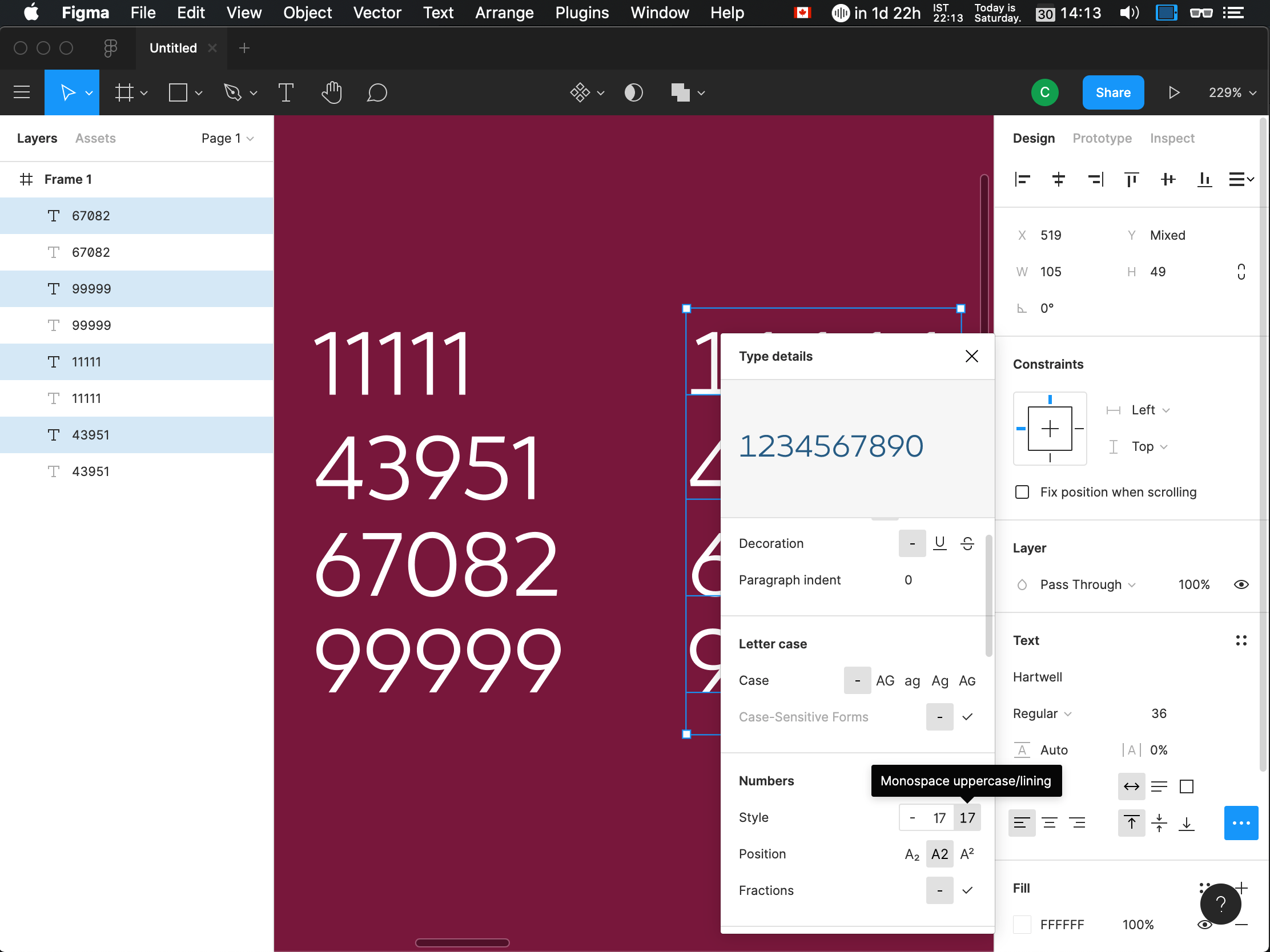
Hard to find, hard to remember, but hey—it works!
Whether you design and implement fun features that might make numbers move around, or are responsible for screens that convey financial information, you now know the one thing they have in common and have the ability to make them work right.
- Not like these are important concepts for designers to know and apply… ↑