AirTable API Documentation
Designing a product is never just about buttons and colors —you need context, content, and data for it to be meaningful.
Sometimes, you have to mock up the data just like you mock up screens. That used to mean creating a database (or *shudder* tapping into production databases), and also creating a small endpoint for REST functionality.
The little-engine-that-could-as-a-service product AirTable has API capabilities that make that option an absolute overkill. Need an API? Create your sheets, fill them in, et voilà, you have an endpoint for your data.
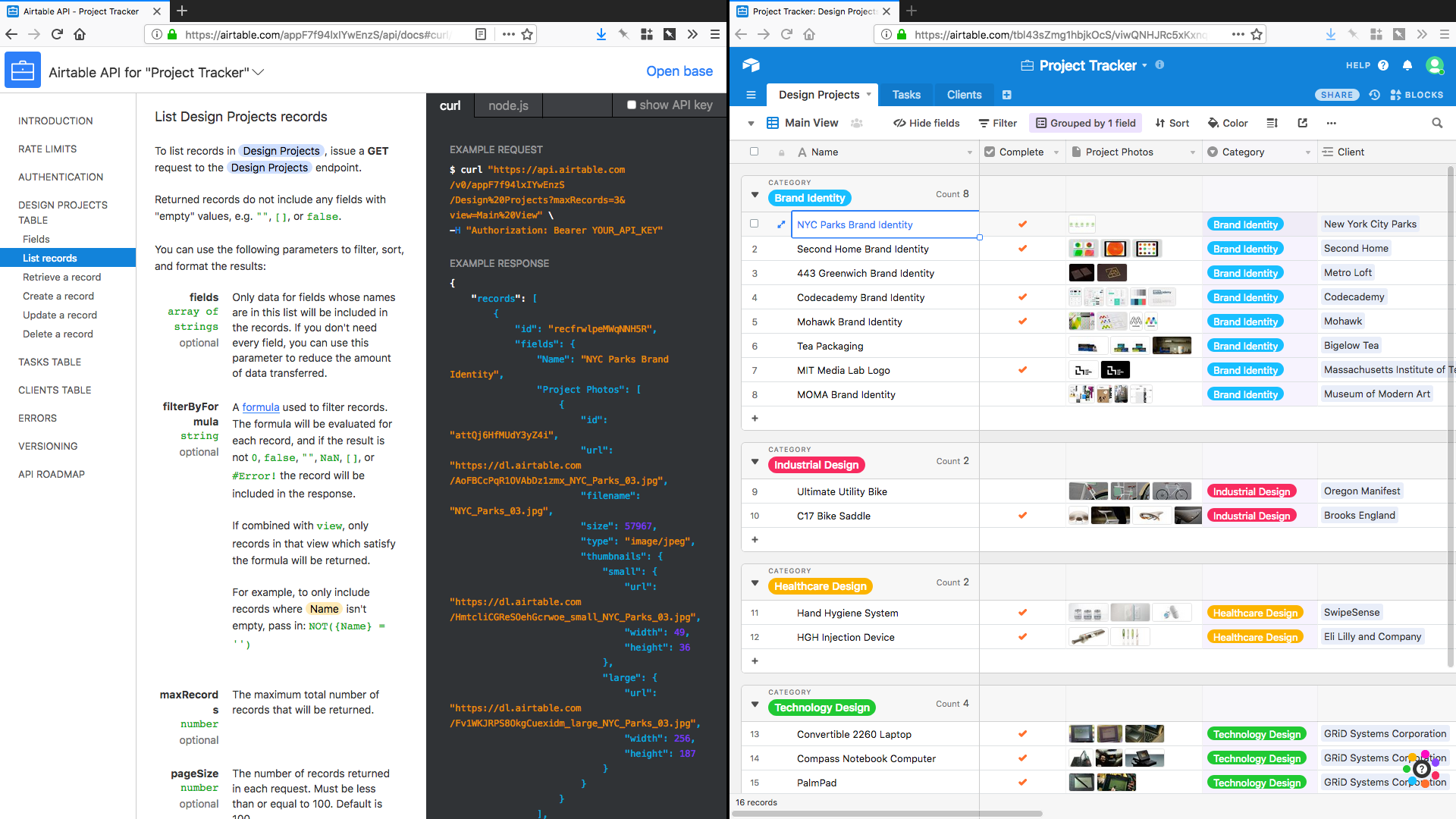
Find me if you can…
The only problem I have with it is glanceability. If you have X pages in your document, the API sidebar grows to X+6 items. Those 6 additional items are stuff that are shared with every other document, like rate limits and authentication details.
There is, however, no easy way to find and differentiate the tables at a glance. Which is a really easy fix.
Just put table names in pills. That’s it. Instant recognizability.
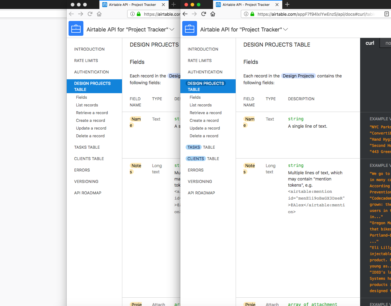
This solution would reduce the time to find a table, especially with larger documents that have more than a couple of sheets.
So, how would one test this?
A 5 second test would be a perfect option for a feature like this. Show either of the screens, collect data from each1, and compare the results at the end of the test.
This is also a good example of quantifying qualitative data, on finding a way to measure an otherwise unmeasurable change.
- Why didn’t I start a test, and collect data to prove myself, you ask? Who’s gonna write all these blog posts then?! ↑