#UXRConf and Accessibility
The very first day the announcement for the 2020 UXR Conference was made, I had two suggestions:
- Show somewhere, anywhere, that the prices were in USD.
- Make the website accessible.
One of the organizers quickly added a sidenote to the purchase button, and mentioned that a few others had already reached out about accessibility failures and they would be remedied.
But they never were.
Here are two examples, showcasing how having an inaccessible website is an inconvenience for both potential attendees, as well as companies that sponsor these events.
The Program
Here’s a screen recording from my interaction with the program.
Headers jump from Level 2 to Level 5.
Items that should clearly be Level 3, Level 4, and Level 5 are all bundled together as Level 5, for visual purposes.
This is easy to fix by using the correct <h1> through <h6> elements, and giving them CSS classes that define their sizes. It would fix hierarchy issues, and make it easier for screen reader users to jump to areas throughout the page.
Accordions have no affordances
There is a visible down chevron next to workshop titles. Clicking on them (not on video) opens them up to show additional content describing the workshops.
The chevron is not keyboard-accessible: it cannot be selected with anything but a mouse pointer. It’s also not announced through the title, and clicking or pressing space on the title does not activate the accordion as well. It is effectively a mouse-only/sight-only interaction, hiding the details of the workshops from many users relying on assistive technologies.
The Sponsors
Here’s another video, from the footer of the page.
Images have no alt text
Companies are not important. Not for this context anyway. It’s only important that screen reader users have no idea what those great companies are.
Just by adding an alt attribute to these images, names of these companies could be made to read out loud by screen readers. Good for sponsors, great for users.
What about the new site?
So, the site has been updated, with a new version, showing updated program and this years sponsors. It’s a complete revamp, so it should be more accessible perhaps? Let’s check it out.
Has content descriptions improved?
I’m afraid not.
There are pictures of speakers, but with no proper alt-text, they are only described as “person, image”.
There’s also no indicator that these are links that open up more descriptions, and are once again not keyboard accessible either. They are <a> tags, but they have no href attribute and are powered by Javascript without any proper ARIA tags used, therefore they are not links for screen readers or for keyboard navigation purposes.
Are sponsors tagged now?
We’re two for two in the game of Betteridge’s Law of Headlines—that means “no” unfortunately.
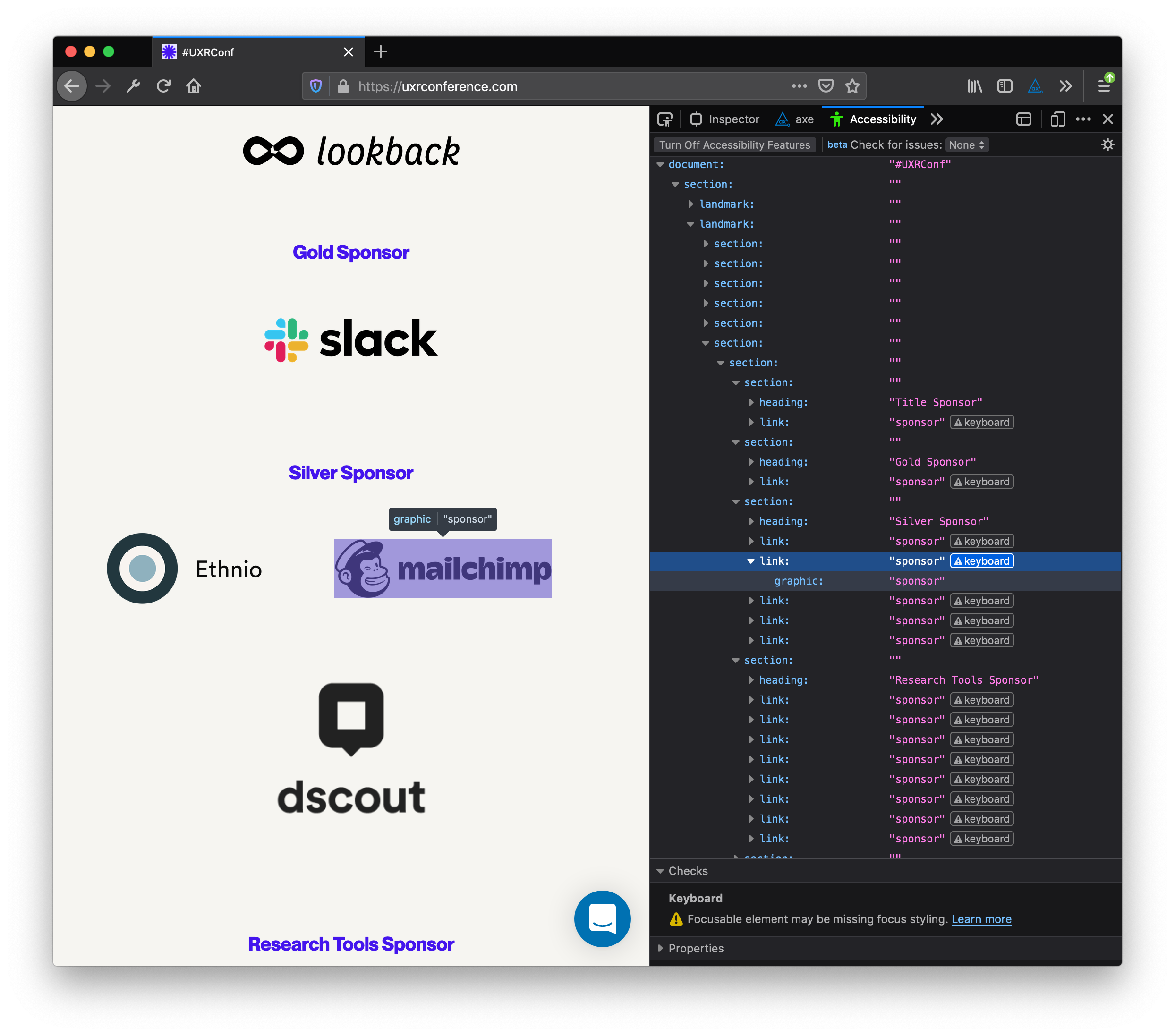
Using an alt-text of “sponsor” for all images only suppresses the warnings. It doesn’t make the site accessible or usable.
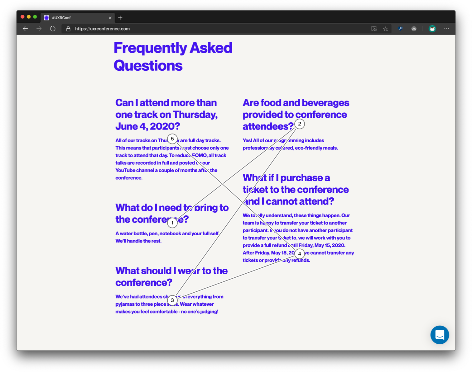
Bonus: FAQ content
For some reason, they’ve ordered the 5 items in CSS, using flexbox and order properties. This results in a weird order when using screen readers.
These are very simple mistakes, and yet they are here. Most, if not all, of them can be fixed with small HTML changes. All of them are low-hanging fruits or easy wins, in the parlance of the corporate world.
They are also wildly popular mistakes, I’m afraid. If only there was some help to catch and fix them…