Netflix Touch Targets
Hi, my name is Cem, and I’m a binge-watcher.
I can’t eat, work, drink, or sleep without Netflix.
I got a TV 10 months after I moved to Toronto, though. Before then, I used my iPad for my binge-watching cravings habits.
Throughout those 10 months, I found 2 rather annoying UI quirks in the Netflix iOS app.
Quirk 1: Can’t Touch The Thumbnail
When an episode finishes, Netflix automatically switches to the next. Sometimes, the timing works great. Most of the times, it needs a nudge.
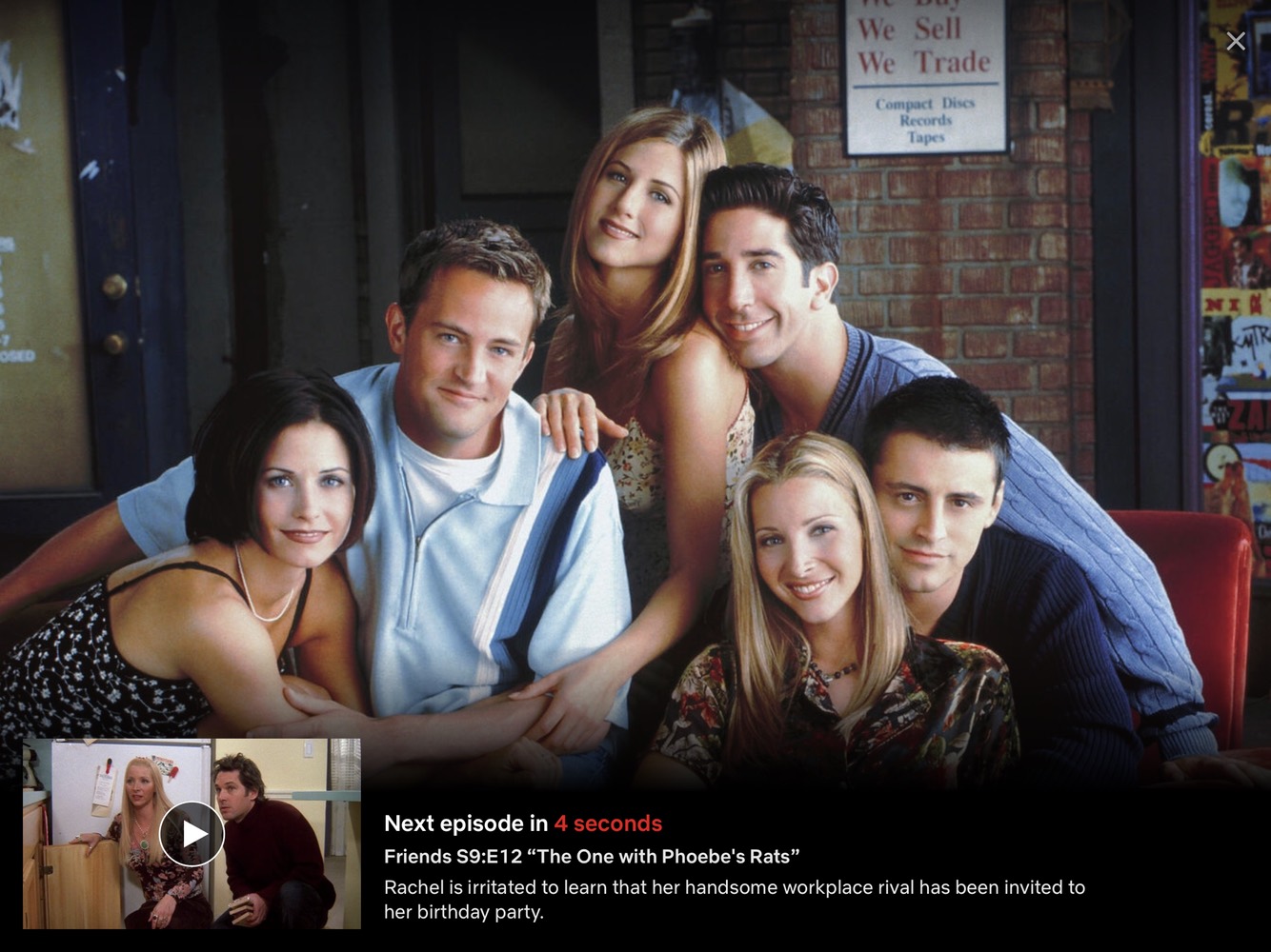
Here’s the problem:
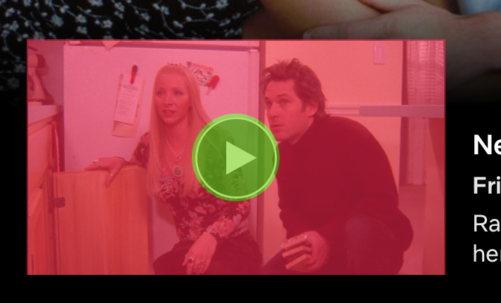
Only the circle within the play icon is a button. Unlike the home screen, where the whole thumbnail takes you to the episode, when switching between episodes the thumbnail doesn’t allow you to tap on it.
This is especially annoying if you’re eating chicken wings. Or fries. Or onion rings. Any finger food that can/will be dunked in sauce, really.
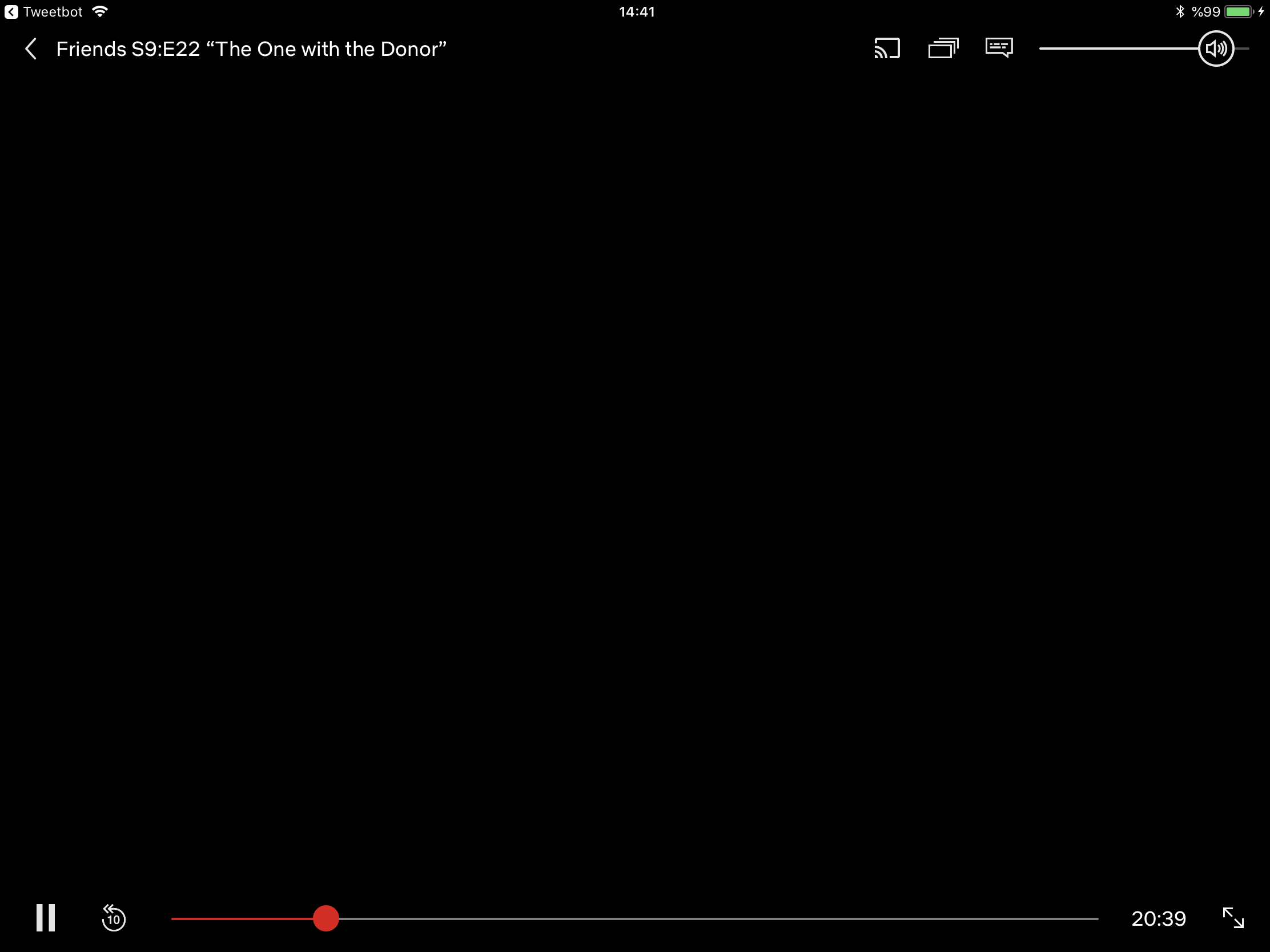
Quirk 2: Can’t Find the Back Button
On iOS, back button has the title of the previous screen attached to it, and the current screen name is either below it, or to the middle of the title area.
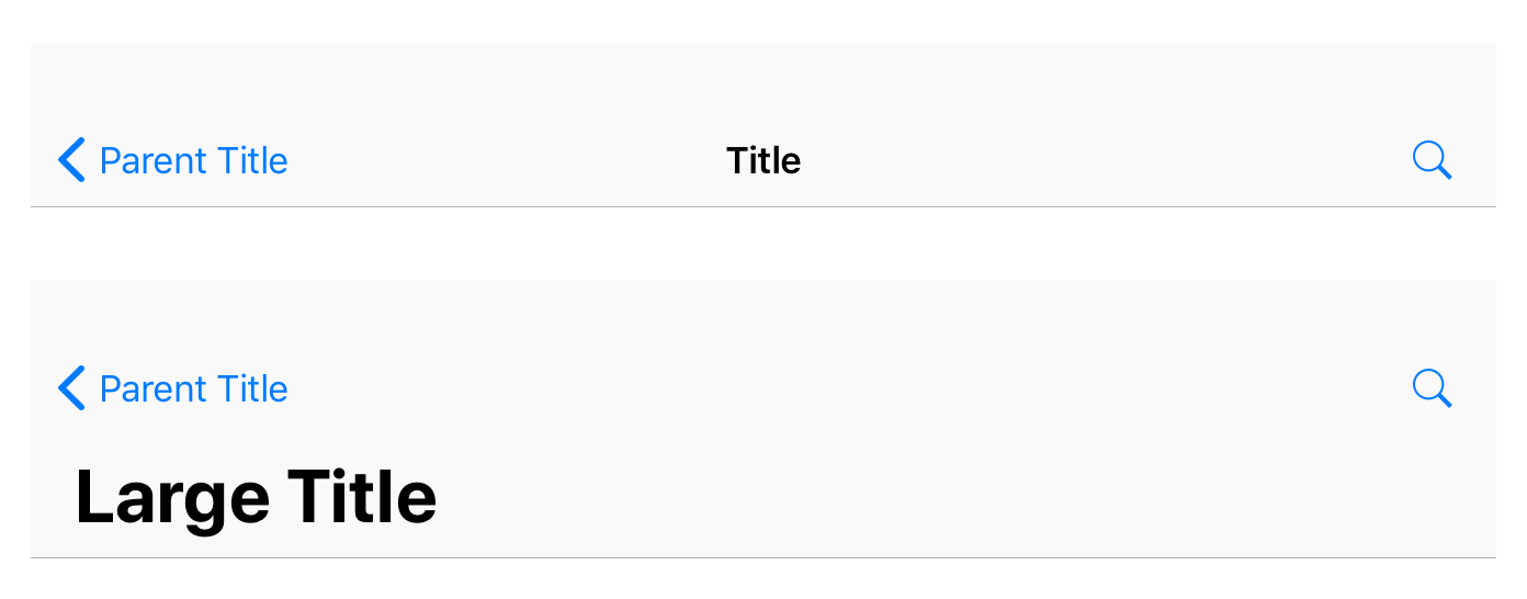
On Netflix, the title of the current episode is next to the back button, but they are not linked. So only the back icon is clickable, but at a glance, the user expects the whole title to be part of the back button, and taps on it to take the action.
Here is a comparison of how it works in Apple’s guidelines versus how it works in Netflix: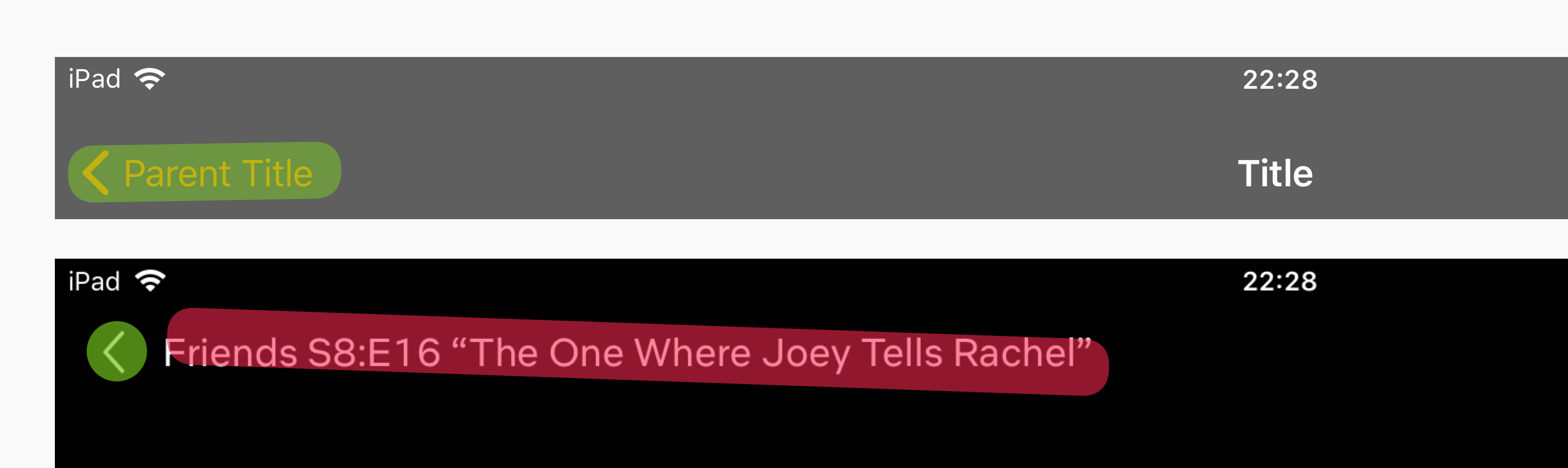
Tapping on the title does nothing, and the app hides all of the on-screen controls like any other point on the screen is touched. So, when in fact the user expects to get taken to the previous page, they lose all of the on-screen controls.
I have seen many people get thrown off by this. They are visibly annoyed when they expect to go back to the episode list, but just lose the button that would take them back. It takes a couple of taps for them to realize what’s wrong.
Bonus: The One with the A/B Tested UI
While writing a draft for this blog post, I came accross a different video player UI in Netflix.
Here’s a comparison:
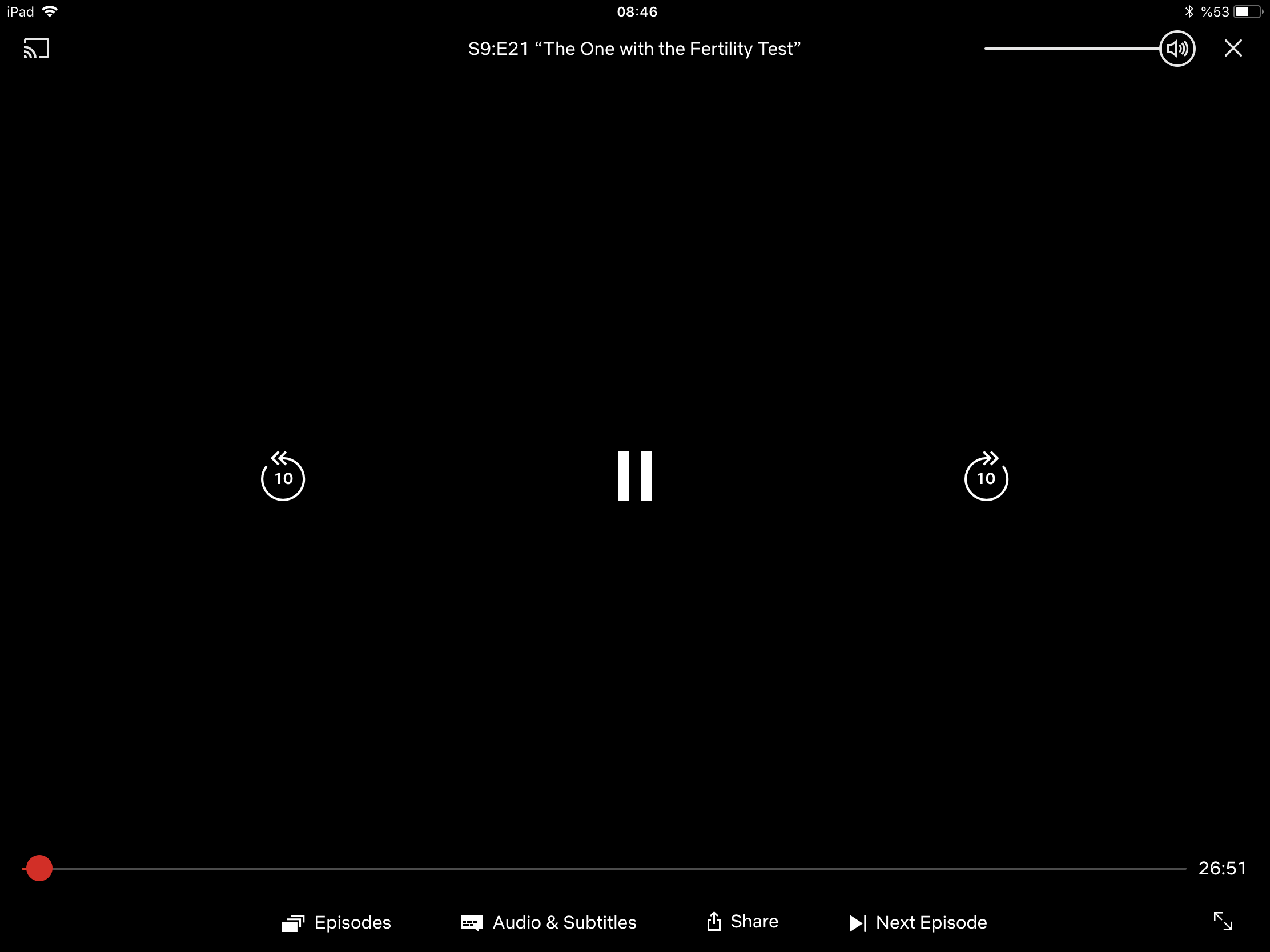
While this did solve some issues with the player interface, it still was not that much better than the old/current one.
The good:
- More prominent player controls.
- Text labels for functions.
- Addition of functionality: Fast-forward and Next Episode.
- Title is centered, as it should be.
The bad:
- No “Back” button; “Close” button moved to the other side, very close to the volume slider.
If this version had the Back button with the name of the show on the top left, and the AirPlay icon next to the volume slider (where it deserves to be, logically), it would have been perfect. Hopefully, they are testing this version with a few fixes, and we will soon see it in an update.