Discovering Montréal('s Transit Passes)
Ah, Montréal…
The city of good food, great festivals, and European traffic rules1.
I recently visited Montréal with my girlfriend to check out the viability of living there. Turns out it felt a little too small and too French for our taste, so we eventually decided to brave it in Toronto.
But after two lovely, walkable days in Montréal, I managed to sprain my ankle and we had to try out the transit system.
Montrealization
Montréal has occasional passes, ranging from a couple of trips to a couple of days.
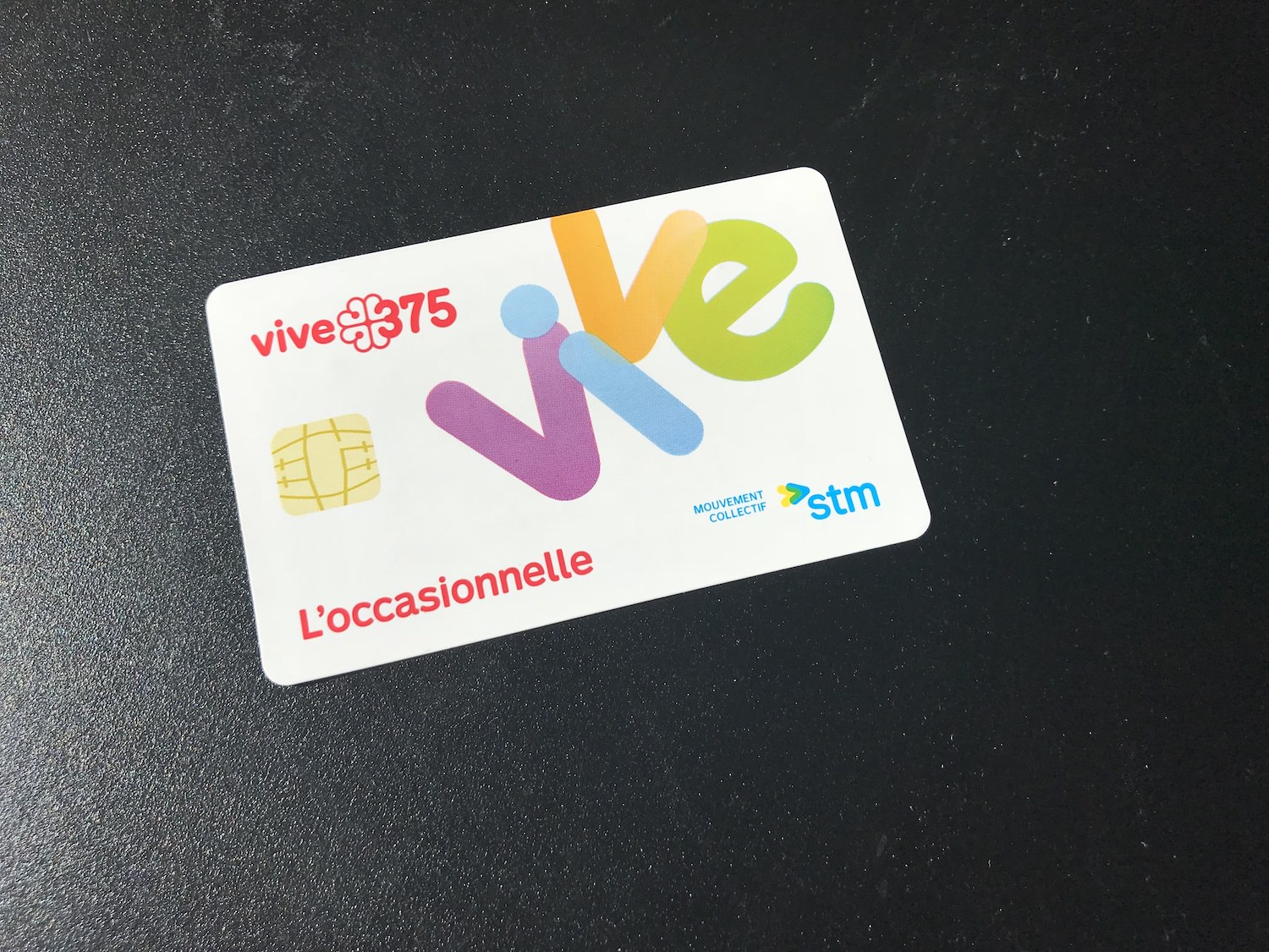
This is the pass card they give you for those passes:

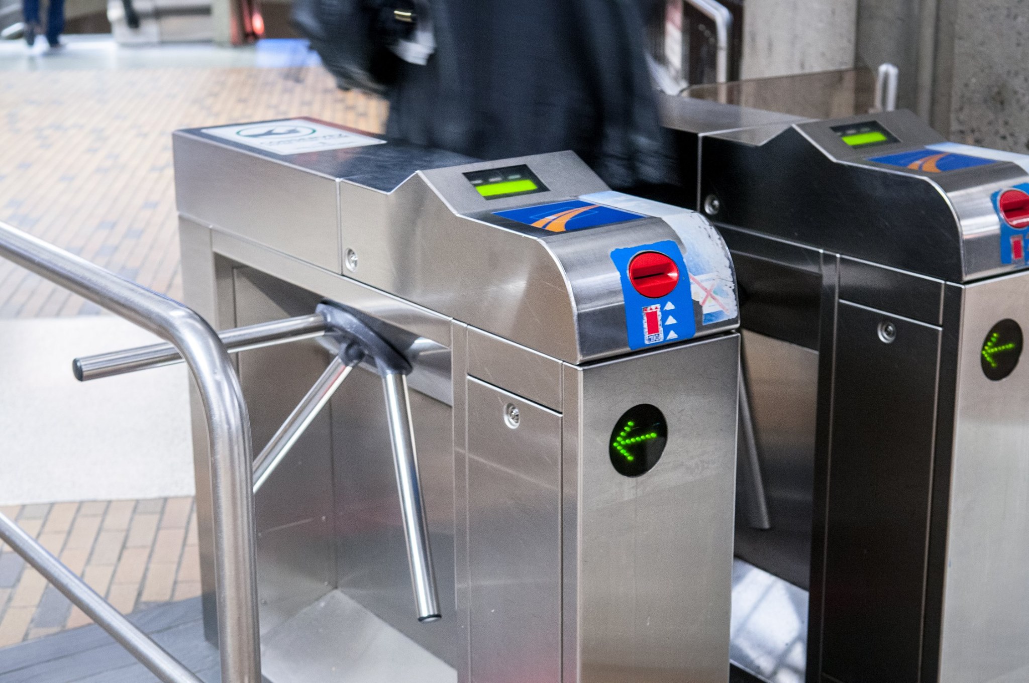
And this is what their turnstiles look like:

The Norman Card
Affordances are clues that tell a person how a certain thing will function, and provide discoverability especially if they are unfamiliar with the situation or item.
This Vox and 99% Invisible collaboration is a good primer on affordances and discoverability:
The problem
When someone gets this card, the chip design says “you can insert this”. The turnstiles, especially when looking from afar, confirm this assumption, “I have a place to insert the card”.
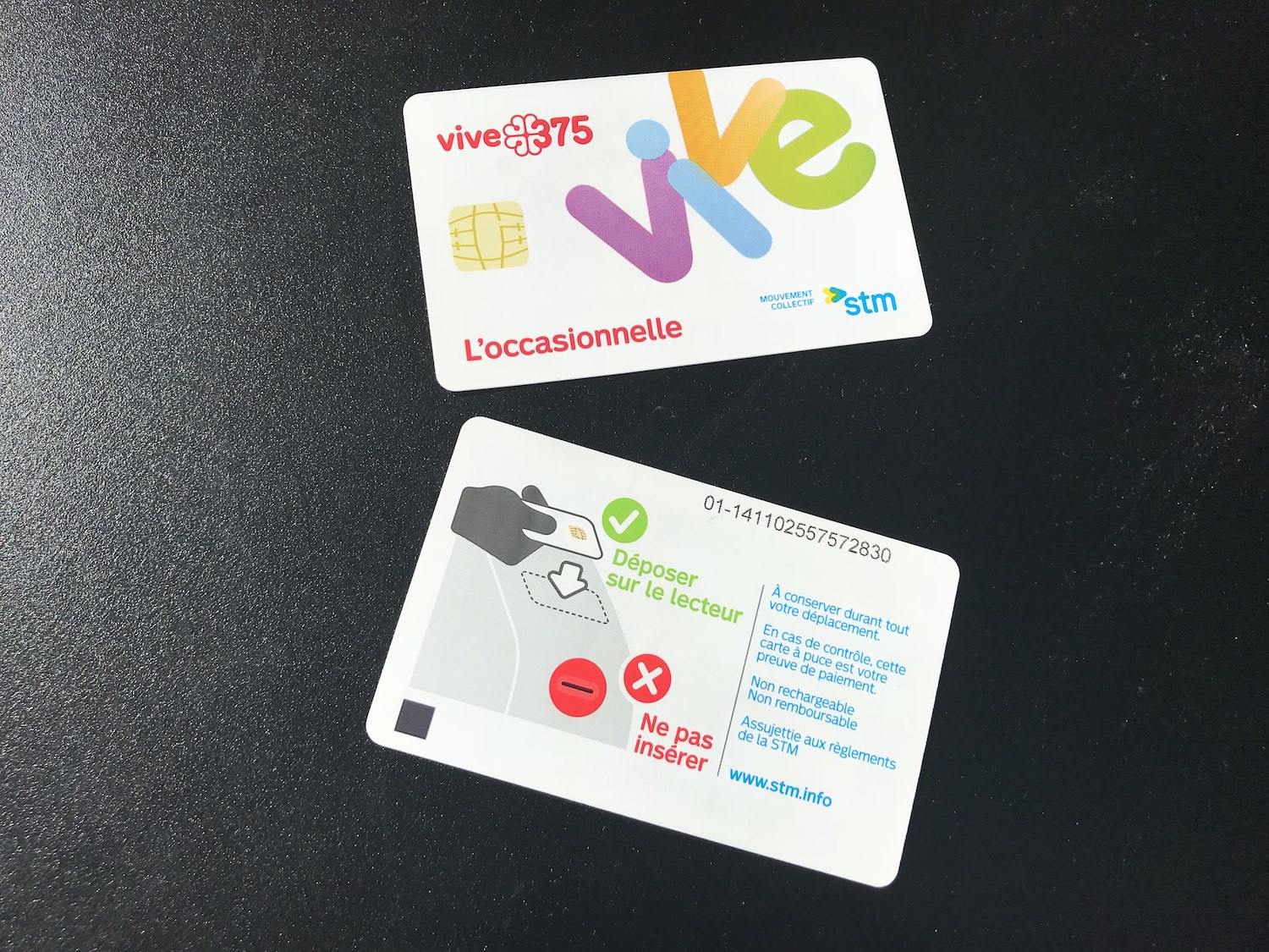
Only when you look at the other side of the card do you get an instruction on how to use the card correctly. And only when you are actually standing right in front of the turnstiles do you see a reader to place the card on.

The Solution
Make it look the way it behaves.
There is no need to make skeumorphic references to functions that don’t exist, confusing and confounding2 people.
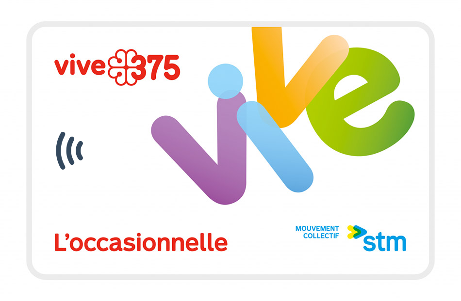
Remove the chip reader illustration. Replace it with the antenna icon that means “contactless”, which is widely used on credit and debit cards.

Simple, informative, and looks better IMHO3.