The End of an Era: Hamburger Menus
I’ve never liked—or designed with—hamburger menus. They are hard to reach, the context changes when a user goes deeper within the navigation, and it is basically just sweeping menu items under the carpet. “We cannot properly design an information architecture? Let’s do a hamburger!“
Unfortunately, no matter how much I pay attention to not creating hamburger menus, I still had to deal with them as a user.
But good news, everyone, this is finally starting to change.
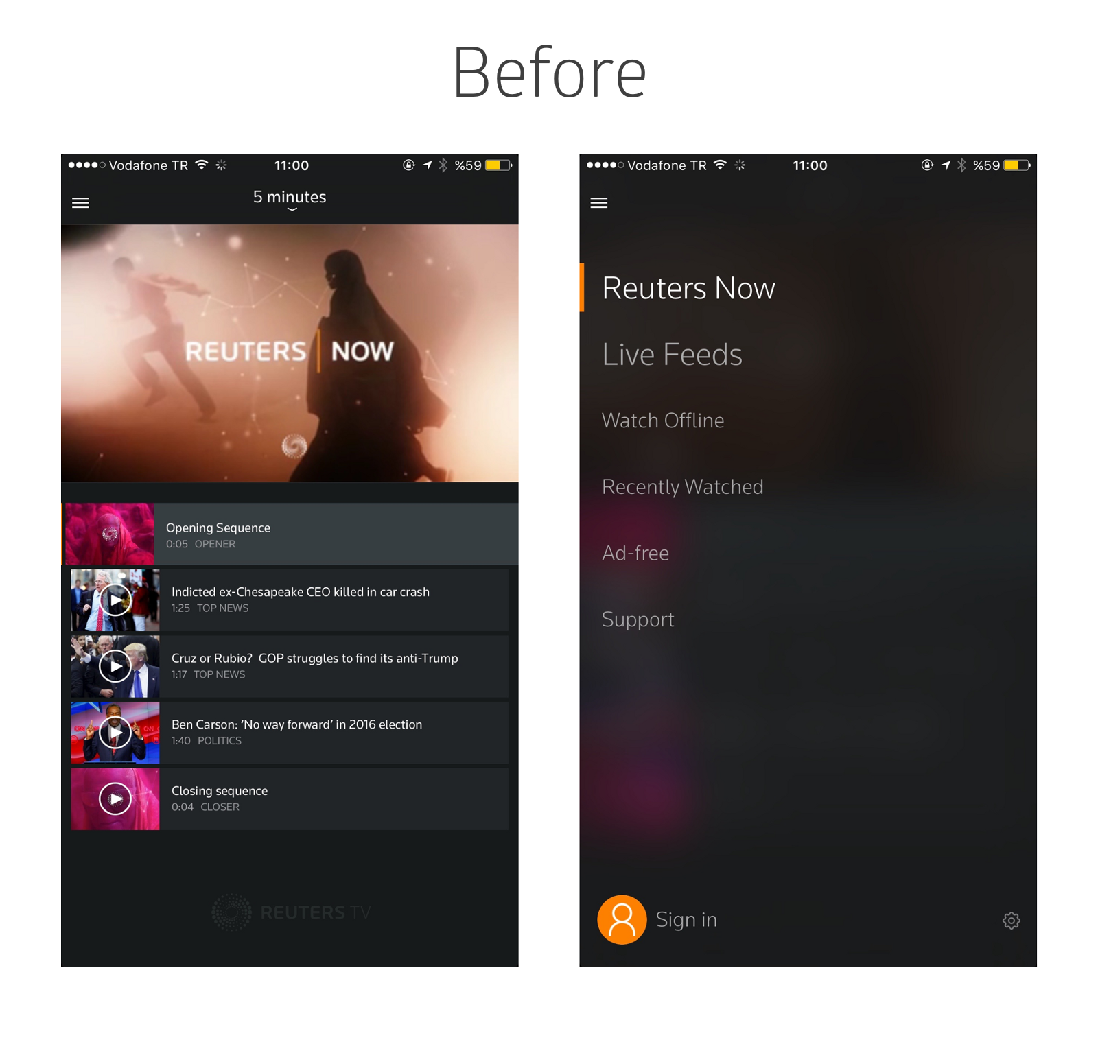
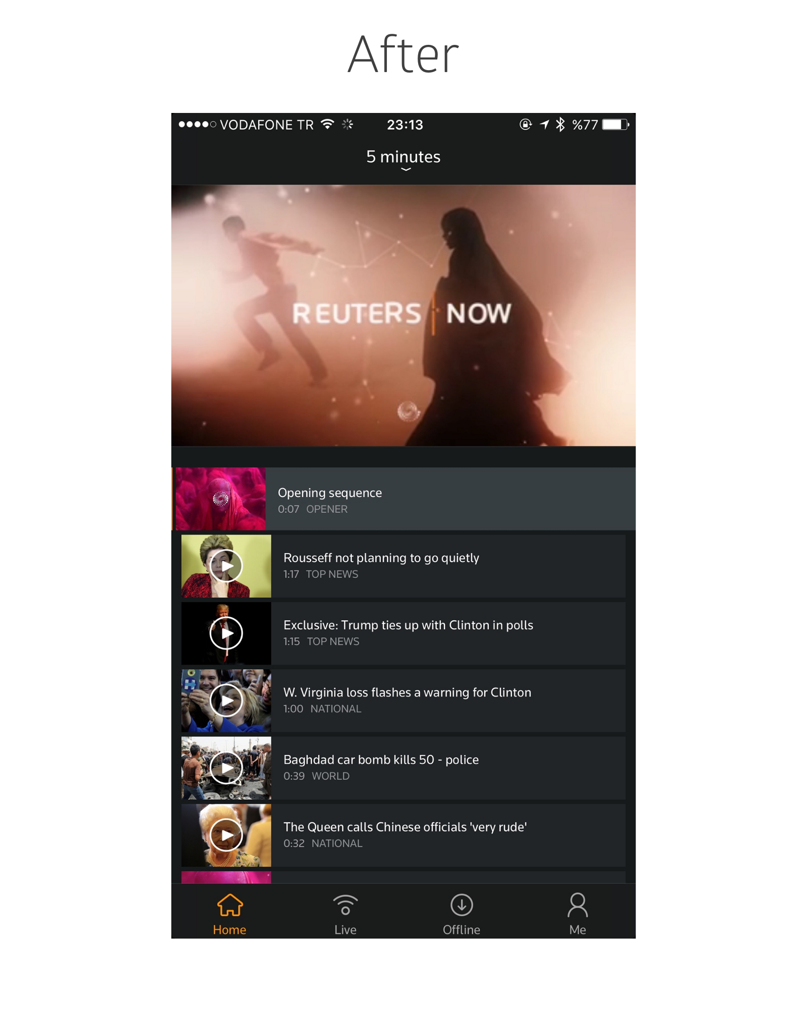
Reuters TV [↗︎]
Reuters TV is a great news app. You choose how much time you want to dedicate to news, and it creates a summary in the form of a video playlist.
In the beginning of this year, they switched from hamburger menus to tab bars. The version history quoted:
“Hamburgers belong in Wendy’s” said Hunt Chetley, a prominent technology analyst.
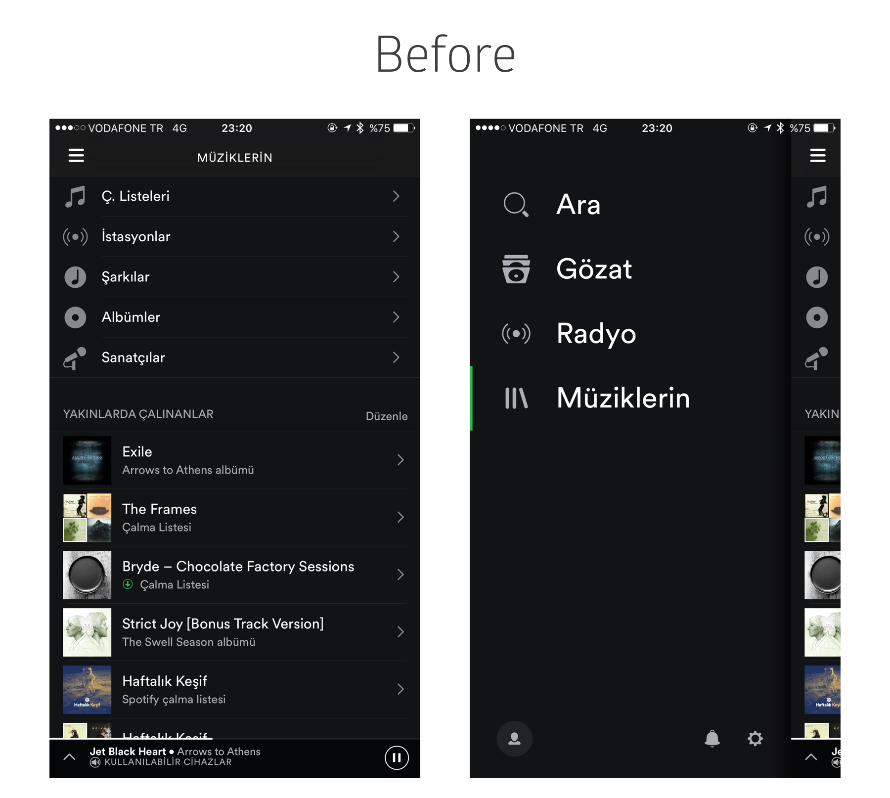
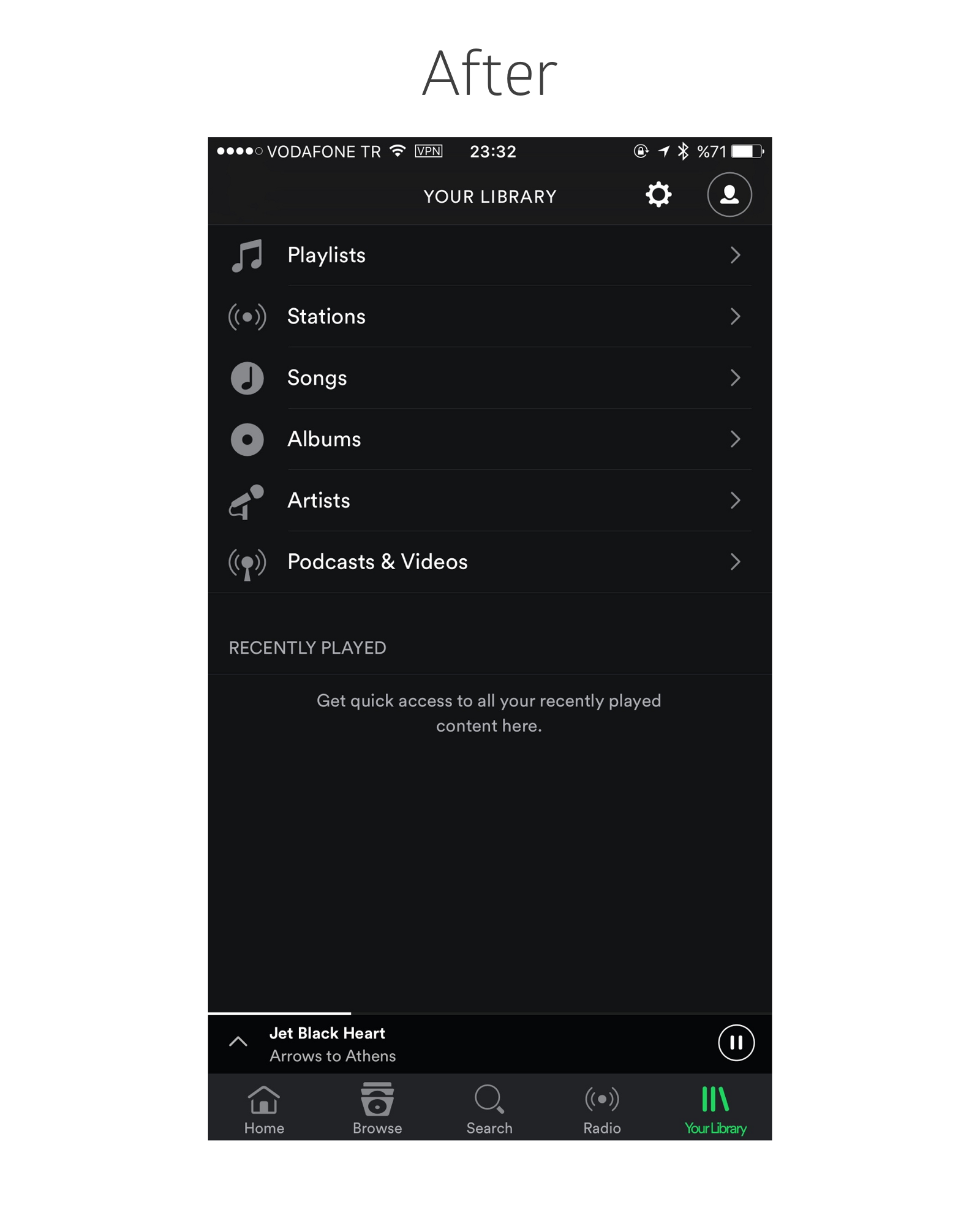
Spotify [↗︎]
Spotify’s change from hamburger menus to tab bars was quite the news, featured in The Verge and TechCrunch, among other outlets.
Started out as an A/B test that favored tab bar by 30%, the launch of the new usable design was at first limited to a few countries, but after weeks of waiting, now I believe everyone can enjoy the accessible navigation structure.
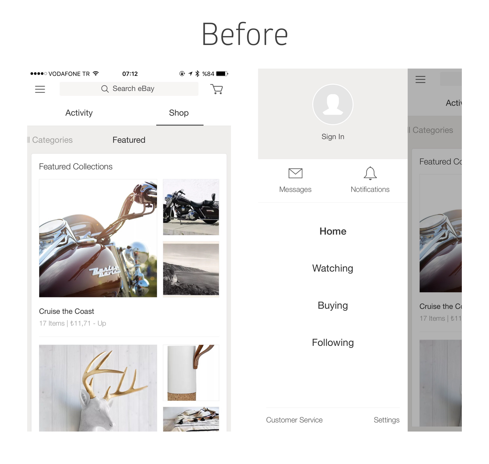
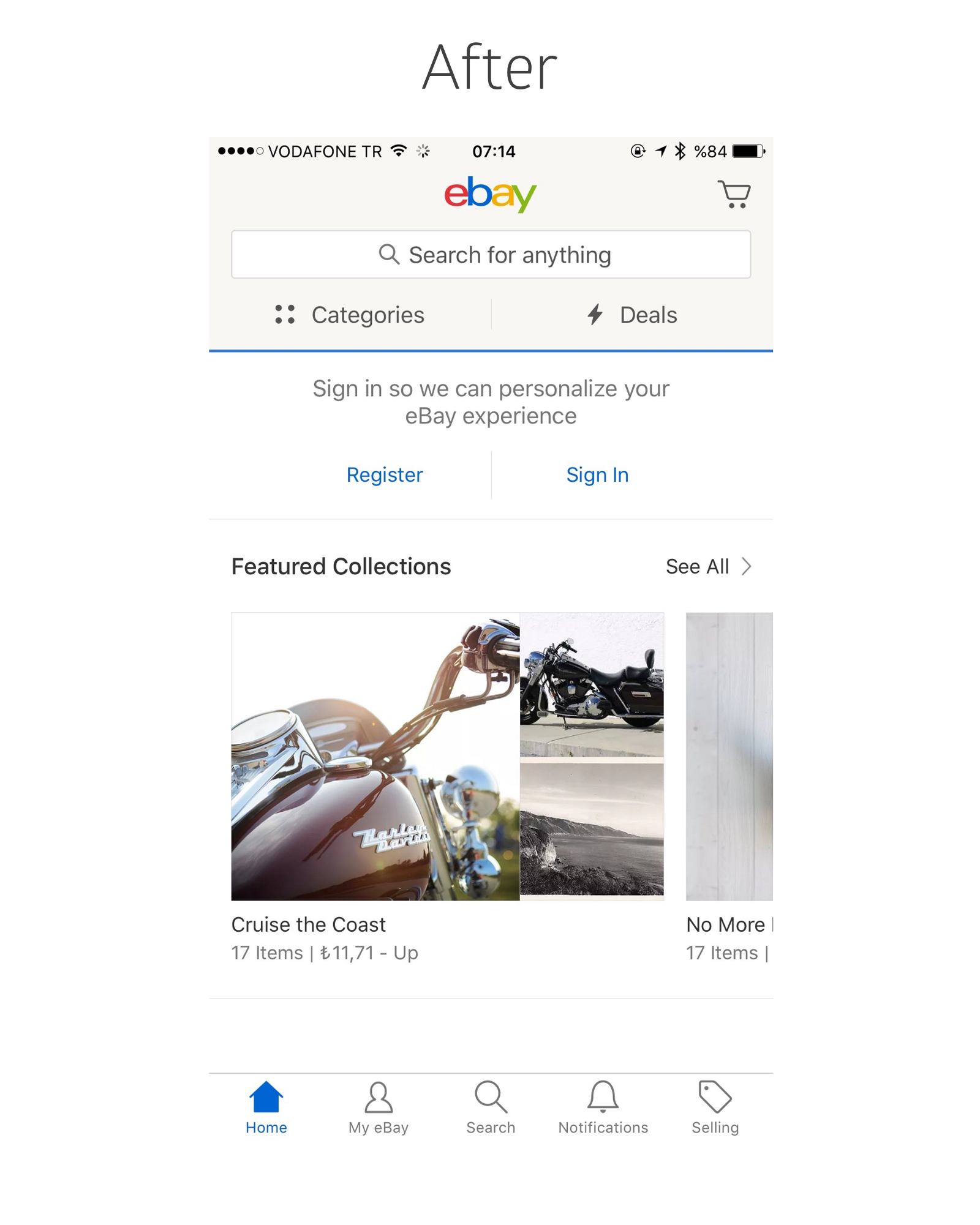
eBay [↗︎]
As Cem awoke one morning from uneasy dreams, he found eBay’s hamburger menu transformed into a sensible tab bar.
eBay had been one of the leading suppliers to my hobbies and new-found interests. I’ve bought everything, from second hand guitar pedals to Soviet camera lenses through it. From time to time, I also browsed the site through its iOS app.
Android [↗︎]
One of the reasons for my distaste of Android was the forced-by-guidelines hamburger menus. Therefore designers and developers doing cross-platform apps resorted to this one simple trick, because it was a) compliant with one of the platforms and b) it was just easier to tuck everything in one place rather than calculating where it all goes.
However, late last year, Android did us designers a favor. First one, then two Google apps started using tab bars. After some time, the new rule also showed up in the guidelines. Designers rejoiced.
yes, that’s a bottom navigation bar on two Android apps from Google. pic.twitter.com/2JvJ1X1nc2
— Luke Wroblewski (@LukeW) March 2, 2016
Is it over yet?
Not really, no. Uber still uses it. Amazon still uses it. Hamilton app still uses it. And so does many other big and small outlets.
We haven’t reached peak information architecture, but with mindful design, it’s not really that far away.