Basecamp 2FA Authentication Activation
I never thought I’d be criticizing a Basecamp flow here. Not in a million years.
After all, they are the inspiration behind some.design; millions of–internet–years ago, they started out as a design consultancy company, doing the exact same thing1 I’m doing with some.design.
They are also literally the creators of the tool that enables this business.
Alas, here we are.
On the subject of notices
I logged into my Basecamp account one day, only to be greeted by a gentle banner, reminding me that Google-free two-factor authentication (2FA) was now possible.
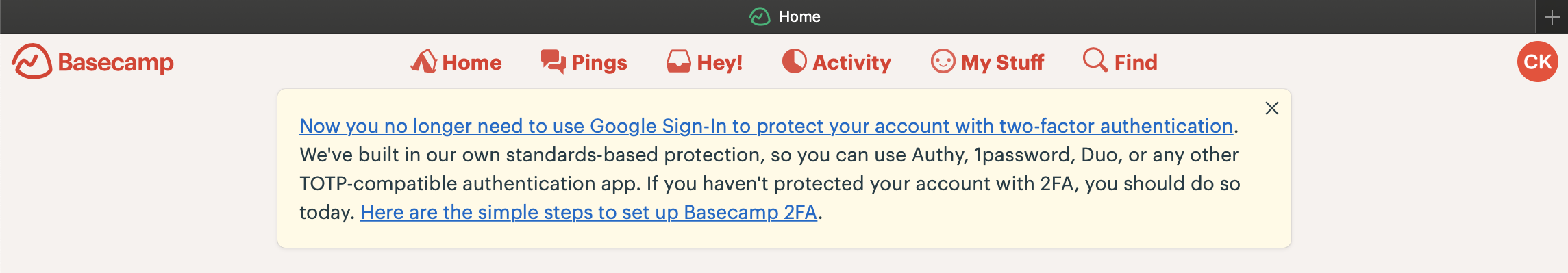
Here’s a recreation for mobile and screen-reader users:
“Now you no longer need to use Google Sign-In to protect your account with two-factor authentication. We’ve built in our own standards-based protection, so you can use Authy, 1Password, Duo, or any TOTP-compatible authentication app. If you haven’t protected your account with 2FA, you should do so today. Here are the simple steps to set up Basecamp 2FA.“
Let’s disect this banner a bit.
First the good parts.
It’s right below the menu and above any other item, and it is clearly differentiated from all the familiar components with a different background color. It is clearly a box telling you something. It has a close button, so it can clearly be removed.
All great elements that make up a good information banner.
However…
There’s no title, and there’s no apparent call to action (CTA) button. A title is usually a summary of such a banner, and that function has been pushed onto the first sentence by turning it into a link and styling it so that it is brought forward.
Same happens with the last sentence; it is again a link. I am sensing a deliberate choice in words to not make it feel like an action button: after all, CTAs can be pushy, which Basecamp does not care for.
Again, two different approaches, both done intentionally, both that are not big issues.
So, what to fix, when there’s nothing to fix?
The links, obviously.
The first link goes to a blog post explaining the reasoning and actions taken, which is good.
The second link goes to a help article explaining steps needed to enable the new 2FA login protection, which is even better.
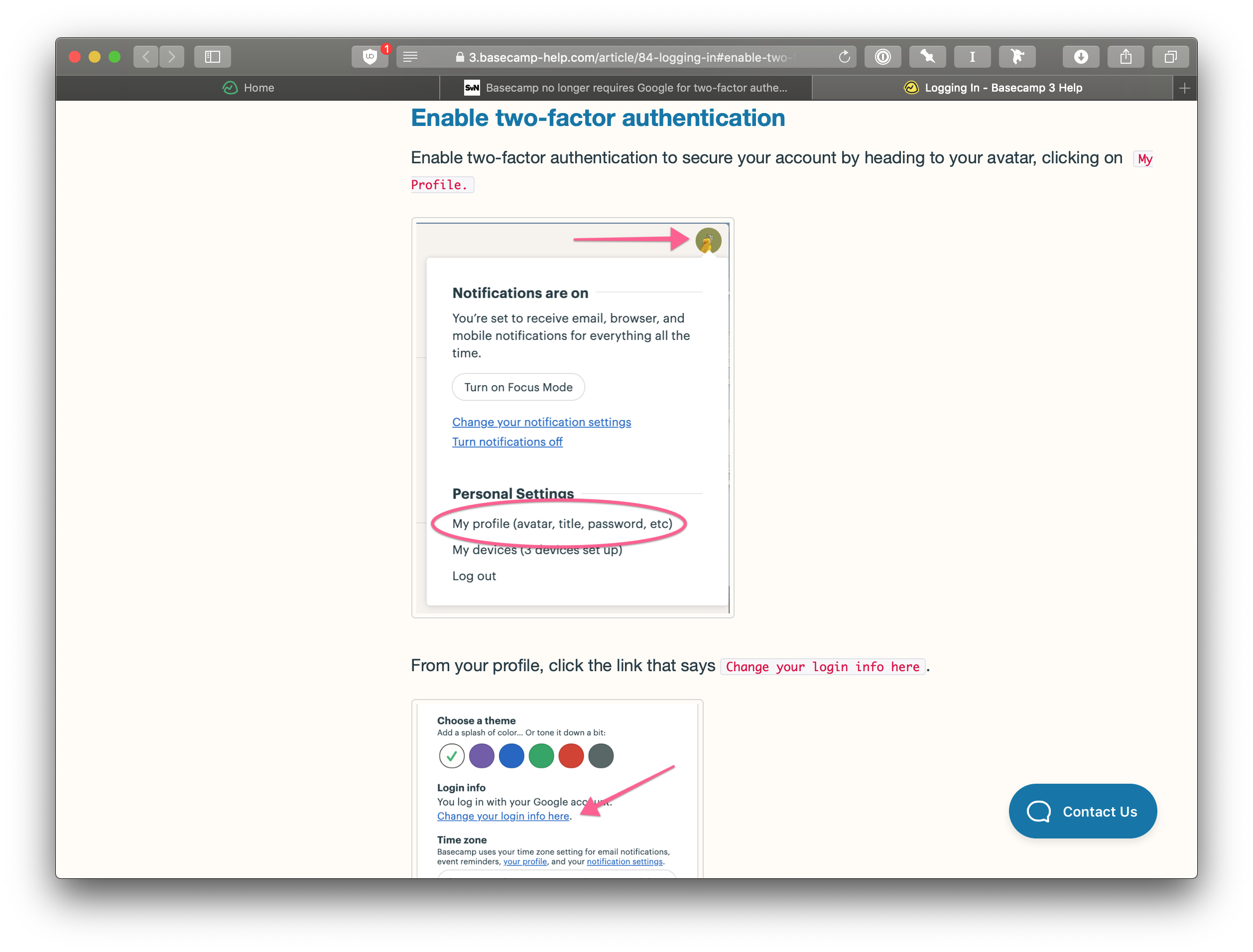
But after that, it’s just text explanation and images (that are labeled as “decoration”) to go here, click there.
All steps that could be avoided if only linked to this page directly: https://launchpad.37signals.com/identity/login_option
The article is especially worse for it because the first step is to “head to your avatar”, when in fact a) not every user might have an avatar, which Basecamp defaults to initials of the user, and b) because it doesn’t expose that element as the “avatar” for screen-reader users.
One more thing:
When using an abbreviation, the right way is writing the long phrase first and putting the abbreviation in parentheses in the first mention. I’ve done it here, and so has DHH in his blog post.
You know where it’s missing?
That’s right, the banner.
Here’s a nice PDF of their pitch deck from 2002:
↑
http://37signals.com/x-why_hire_37signals.pdf